Length
5 min read
Have you ever broken your arm? If so, you may remember how difficult life became. Something as simple as paying a bill online required both hands, not to mention cooking dinner or picking up the groceries.
If you’re a parent – and spent the best part of a year holding a baby while performing everyday tasks – you’ll understand this experience, too.
What about overseas travel? Have you ever found yourself in a foreign city where the language could be more familiar, trying to navigate the public transport system or order a meal? When you’re simply on a website trying to perform a basic task, and it’s full of jargon and technical language?
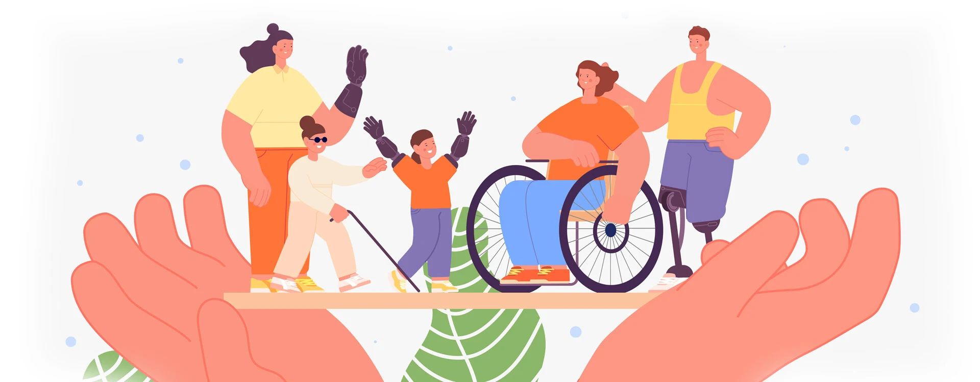
Inclusive design matters. And when it’s done right, it makes life easier for everyone.
So, what is inclusive design exactly?
Inclusive design means designing in a way that allows everyone to engage with your product or idea, including people with a disability and people of various ages, genders, cognitive abilities and cultural backgrounds.
Inclusive design means no one is left out or left behind, and everyone can use everything. Designing inclusively also gives everyone the same experience. Think about it this way – if you design a website that someone with dyslexia can use or an entrance to a building that a person in a wheelchair can access, everyone else can use it, too. And we’ll all have the same positive experience, rather than some people feeling different or excluded.
Designing for everyone significantly benefits business as well as making the world a better place.
Take disability as an example – there are around 1 billion people worldwide with some form of disability. Designing for everyone means a broader audience can use a service or product – indicating a much larger return on investment for any business.
Inclusive design examples
Common reasons design isn’t inclusive (and reasons why it should be).
We all know that design is only sometimes inclusive. We’ve had terrible experiences with products and services that may have left us wondering, ‘Did that brand even want me as a customer’?
It’s an extra layer of frustration when you need help accessing a product or service. For example – imagine how a blind user must feel if they rely on a screen reader to access a website that hasn’t been built to accommodate one. Or a low-vision user who finds everything is in ‘brand colours’ that they can’t see…
There are many reasons why design isn’t universally inclusive, but many more reasons why it should be. Here are just a few we’ve noticed, particularly in the digital space.
Unintentional exclusion: when business and service providers don’t know.
The problem: Many companies are unaware they’re excluding people. Particularly in the digital space, they may not be aware of visual accessibility standards or the importance of writing content people can understand. Smaller businesses may need more resources to hire the right people or to upskill in these areas.
How to move forward: If businesses have the resources, we recommend they prioritise accessibility as an urgent action. There are countless companies – including Symplicit – which can help. For businesses that lack the resources to hire externally or engage consultants, there are many free (visual) accessibility checkers and guides online. Free readability checkers can also recommend whether content is written in plain English.
Established brands and the problem of: ‘But that’s how it’s always been done.’
The problem: There are countless companies, particularly older brands, that use colours, logos and typefaces that visually impaired users need help recognising. In many cases, they’ve been around for 50+ years, and the company is slightly resistant to change. ‘But that’s how it’s always been done’ is an argument we often hear.
How to move forward: Firstly, it’s worth recognising that a lot has changed over the years. Many brands started before the internet existed or when website standards were inferior. We only sometimes knew, for example, that specific fonts and colours are more challenging to read if you’re visually impaired. But we do now. It’s important for companies to adapt and evolve as new technology and consumer expectations emerge. It will be better for business too!
Trends that are cool but not accessible: some difficult truths for designers.
The problem: What’s cool isn’t always accessible! Every year, designers introduce and pick up many new visual design trends far and wide. Frustratingly, they’re often pushing the use of fonts and colours that aren’t accessible.
How to move forward: We must remember that trends may change quickly, while human behaviour often evolves over an extended period. That’s why we must focus on what’s inclusive and accessible rather than just following the latest trend. Likewise, designers must remember that the core foundation of design isn’t just what looks good but what solves a problem as quickly and efficiently as possible. Sometimes, that might be black text on a white page.
Can we leave you with one thought? Or three?
The TV remote control. Electric toothbrushes. The voice command that powers our phones (which, in turn, assists us in our cars and even our homes). These are all everyday tools that many of us love to use and probably couldn’t imagine living without. Interestingly, each was developed on the principle of inclusive design – specifically to meet the needs of users who weren’t having a good experience using the original or existing product.
The remote control was designed to assist older people struggling to get up and down to change the TV channel. The electric toothbrush was designed to help people with poor motor skills. Voice control was initially intended for blind users.
It’s been proven time and time again. Thinking inclusively – and designing for everyone – leads to innovation and a world more people can enjoy.